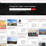
For a while the design of the Forargyll.com website has been creaking. Obviously there’s the website’s popularity and its regular traffic above 3,000 unique visitors, but there’s also the increasing relevance of mobile devices as opposed to desktop. It is still the case that we get most traffic from PCs, but the proportion is declining and this or next year we expect mobile devices to take over.
So, we went looking for something that would give us two things: device flexibity and article readability, with also the capacity to include our red and green thumbs in the comments (among many other things). It also needed to be a light design, not using up too much bandwidth, as well as a more visually appealing layout.
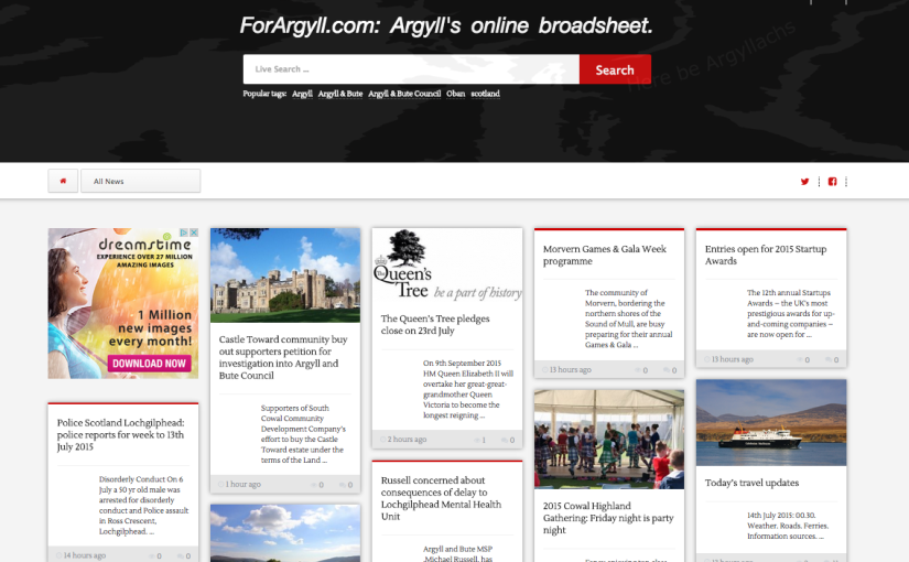
Now, as a designer I’ve always enjoyed the pinterest model, particularly because it allows the reader to experience the serendipity of the newspaper reading experience – you never know what you are going to see next. Eschewing fixed sections and relying on presenting the freshest stories first, alongside putting the search facility front and centre, we think this should create a level of welcome variety for the reader which we hope will engage everyone further.
There are some other nice touches: the order of the articles changes on the homepage depending on their length – you actually see them move around sometimes. The comments section is a great improvement and all the new media icons are baked in, speeding up the website considerably. The ads are served as part of the design, and this means we no longer have to integrate cumbersome thirdparty applications, which is delightfuland we’ve done something fairly whizzy with the header image – it’ll take a minute or so of close observation to notice. You might ask why, and the answer will be, well, why not, because in a sense, that’s what it’s there for.