#Update on #whackingWPYII2, the #fakeplugin invading #wordpress #wp

Have to say I was a *little* premature on declaring success. I’ve got a couple of updates to my previous post about this pernicious WordPress hack (Disinfecting for WPYII2 – the #fakeplugin invading WP and how to kill it #wpyii2 #killwpyii2).

  1. Do get rid of all the excess .htaccess, but if they keep reappearing in directories where they aren’t necessary (a) delete the code and insert some harmless text eg. #boil your head wpyii2# to stop them affecting the function of your website and (b) you’ve definitely missed some of the fake app’s php files, see (2) below.
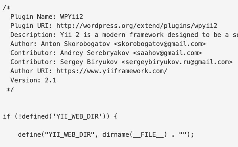
  2. Fake php files are hidden in a variety of directories where you may not be familiar with what *should* be there. Obvious vector directories are in the plugins – particularly the ones everyone has. Akismet is an obvious one to examine. File names include a series of numerals, as well as the following that I’ve seen: index2.php, content.php, radio.php. The latter, non-numeral files, tend to be c. 4.41kb in size and will have a date last modified later that the files in which they sit. As previously mentioned wp-admin is also often used, particularly /wp-admin/css/colors/
  3. Some recommendations for those of you that can’t upgrade to the latest (greatest) version of WP – which you should absolutely do if you haven’t a very VERY good reason not to.
    1. Use a fully configurable firewall app such as WordFence – this has a bunch of very useful features straight out of the can. But it is subscription so you might want to also implement the plugins like following instead, or as well as:
    2. Login No Captcha reCAPTCHA (Google) by Robert Peake and Contributors – this will stop hackers getting into the admin area by force – or at least it has so far.
    3. WP Force SSL by WebFactory Ltd if you have SSL – which you should by now.
    4. BBQ Pro (as recommended in the last post) by Jeff Starr 
    5. Make sure you have in your “define( ‘DISALLOW_FILE_EDIT’, true );” config file, and that this file is linked in to your WP install’s directory rather than hosted there.

I am happy to report all websites are now clear and functioning perfectly, even the ones on deprecated versions of WP, plugins and themes.
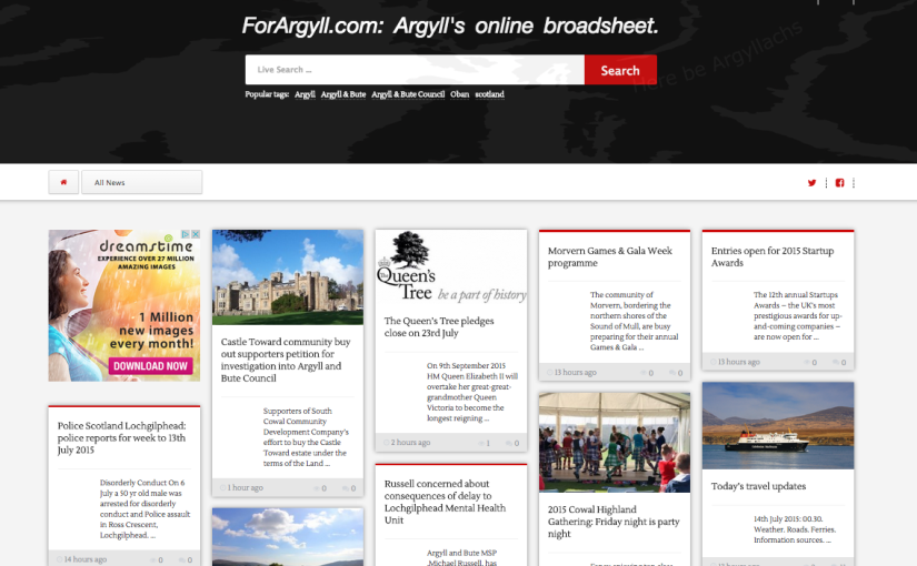
Going Mobile! ForArgyll.com’s new design is Go!

For a while the design of the Forargyll.com website has been creaking. Obviously there’s the website’s popularity and its regular traffic above 3,000 unique visitors, but there’s also the increasing relevance of mobile devices as opposed to desktop. It is still the case that we get most traffic from PCs, but the proportion is declining and this or next year we expect mobile devices to take over.

So, we went looking for something that would give us two things: device flexibity and article readability, with also the capacity to include our red and green thumbs in the comments (among many other things). It also needed to be a light design, not using up too much bandwidth, as well as a more visually appealing layout.

Now, as a designer I’ve always enjoyed the pinterest model, particularly because it allows the reader to experience the serendipity of the newspaper reading experience – you never know what you are going to see next. Eschewing fixed sections and relying on presenting the freshest stories first, alongside putting the search facility front and centre, we think this should create a level of welcome variety for the reader which we hope will engage everyone further.

There are some other nice touches: the order of the articles changes on the homepage depending on their length – you actually see them move around sometimes. The comments section is a great improvement and all the new media icons are baked in, speeding up the website considerably. The ads are served as part of the design, and this means we no longer have to integrate cumbersome thirdparty applications, which is delightfuland we’ve done something fairly whizzy with the header image – it’ll take a minute or so of close observation to notice. You might ask why, and the answer will be, well, why not, because in a sense, that’s what it’s there for.

Refining the Special Sauce: A pinch of SQL, a peck of PHP, a dash of CSS. Delicious.

Silence on this blog over the last day or so, as I have been refining our production process – the Special Sauce of the title – by tinkering with the mix of PHP / MySQL / CSS which form the basis for the websites we run. That and using applescripts and folder actions to automagically print jobs saved from orders – a mouth-watering topping if you will.

If this sounds like unpalatable gobbledegook, then saying collation is my next challenge, and after that some insecure headers,  might make you think  I have lost it – either that or  I am making headway with improving Scottish Laird’s online infrastructure. In any event, it is certain to ensure the business copes with the oncoming Christmas tsunami more elegantly than it did with the last …

And once all of these technical considerations have been broiled into an elegant soupçon, I’ll be heating up the latest iteration of our business plan for serving in a week or so to HIE – a very slow-cooked dish indeed!

Now, time for supper.

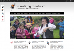
@TWTC website design refreshed with visually edgier theme, giving better access to all of the TWTC content

twtc-newFor the last couple of years the TWTC website has been using a theme from Pagelines which has served us well. However, we started to hit its limits when the number of pages on the website exceed the menu functionalities capacity (128 pages, I think!). So it was back to the drawing board, or rather back to adapting one of WP’s venerable themes. Twenty Twelve lent itself readily and along with a sliding image plugin and some nifty CSS work, the website now looks spiffing and works properly…

… well mostly, Firefox, is good, but the webkit browsers Safari and Chrome are not rendering the sliding images at the correct width. I’ll be working on this over the next few days so check back then (those of you with webkit browsers that is!)

X