tee.uno: t-shirts as blog on a daily basis

You may have wondered why I have been quiet of late, well, for the last month I have been adding a t-shirt a day to tee.uno inspired by something that’s happened during the day, it’s become a sort of blog. A tee-blog if you will. One of the first posts was that tee about BoJo for president

9

Why? Well, obviously in the hope that some of the t-shirts sell, but more because I enjoy designing visuals to be seen. At the moment these designs feel as if they are scratching the surface of the type of tee I wish to create and that after a while I’ll start to develop a typographical / editorial modus operandi that will distill visual and meaning into really pithy, well-wrought slogans.

My favourite is either the previously mentioned Boris for President (US) or Boris for President (EU)… then again maybe it is ‘Brexit entirely Fuxit‘ or even ‘I didn’t come this far, to come this far‘.

I am also working on commissions for a certain theatre company I design for. The Ninja tee (pictured above) is a line from one of their shows… there’ll be a series of these over time!

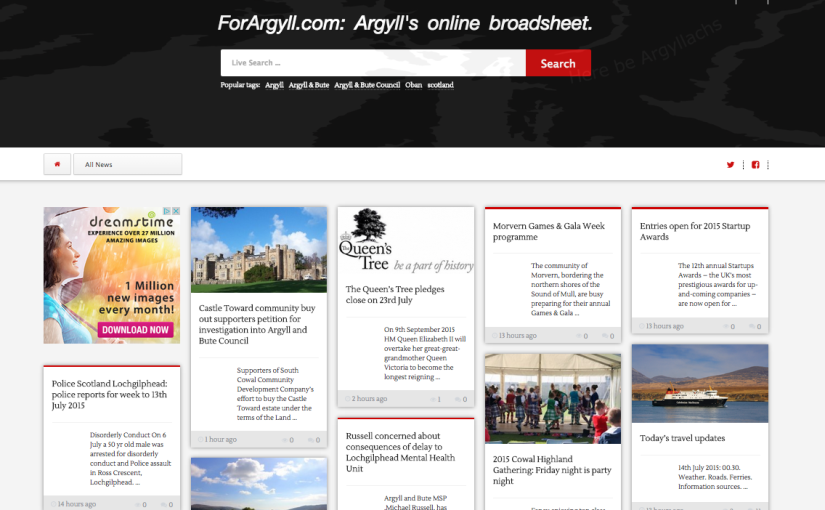
Going Mobile! ForArgyll.com’s new design is Go!

For a while the design of the Forargyll.com website has been creaking. Obviously there’s the website’s popularity and its regular traffic above 3,000 unique visitors, but there’s also the increasing relevance of mobile devices as opposed to desktop. It is still the case that we get most traffic from PCs, but the proportion is declining and this or next year we expect mobile devices to take over.

So, we went looking for something that would give us two things: device flexibity and article readability, with also the capacity to include our red and green thumbs in the comments (among many other things). It also needed to be a light design, not using up too much bandwidth, as well as a more visually appealing layout.

Now, as a designer I’ve always enjoyed the pinterest model, particularly because it allows the reader to experience the serendipity of the newspaper reading experience – you never know what you are going to see next. Eschewing fixed sections and relying on presenting the freshest stories first, alongside putting the search facility front and centre, we think this should create a level of welcome variety for the reader which we hope will engage everyone further.

There are some other nice touches: the order of the articles changes on the homepage depending on their length – you actually see them move around sometimes. The comments section is a great improvement and all the new media icons are baked in, speeding up the website considerably. The ads are served as part of the design, and this means we no longer have to integrate cumbersome thirdparty applications, which is delightfuland we’ve done something fairly whizzy with the header image – it’ll take a minute or so of close observation to notice. You might ask why, and the answer will be, well, why not, because in a sense, that’s what it’s there for.

Scottish Laird takes next step: Facebook and Shopify stores in beta and live now!!

Well, we got tired of waiting and being restrained and tonight have pushed the big red “Go Live” button on our Shopify and Facebook stores which are presently in beta testing – actually its more of unchecking a password protection check box, but you get the idea. All our favourite Lairds and Ladies on FB can buy our titles and merchandise directly on Facebook as well as at our superb new Shopify store here.

In fact there’s a great discount on the Shopify store, as well as some delightful products and new payment methods – we can now take CCs independently of Paypal (“Hurrah!” I hear some of you shout).

By the end of the month the old iteration of ScottishLaird.com will be sidelined and the Shopify store will be our main online outlet. Exciting times!

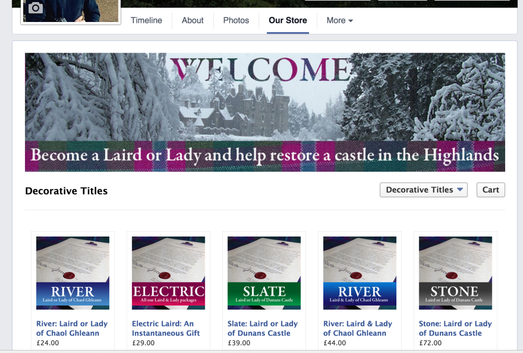
Here’s a screen grab of the FB store, and above is a banner from the Shopify store …

facebook-store

#FabulousFriday: finally closed out the Dunans Conservation Plan books, and redesigned the greeting pack for Lairds & Ladies

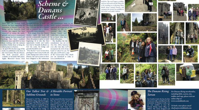
interiorspread-bluefolderWatch the Scottish Laird site for news on the books (in particular our Lairds’ and Ladies’ and the PDF versions), and in the meantime enjoy the inside of the ScottishLaird welcome pack A4 folder. Gorgeous isn’t it? Lots of Dunans Rising tartan, lots of Lairds and Ladies taking the tour, and lots of new information researched through the plan.

Updating posters for @twtc today in a distillation of the TWTC & the West Coast of Scotland using Illustrator

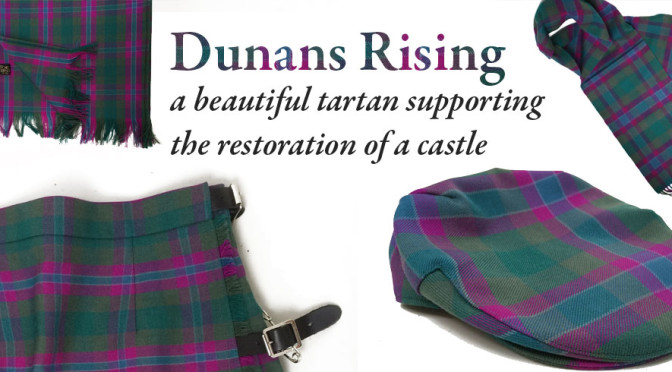
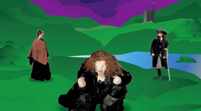
powerof3This poster is one of two that TWTC asked me to design for their projected tours in the UK and North America this year. We had a lot of fun selecting the images of the performers – yes its Colin Little as Long John Silver on the right there – and iconic elements of the Scottish landscape. The tartan is of course ‘Dunans Rising’ from the ScottishLaird project!

The image was created using illustrator and the main font is called ‘Another’ – ‘Futura’ is of course  the other.

Laying out TWTC’s play “the Alloway Rap” into a New Book

Bringing Sadie’s modern version of Tam O’Shanter into print form for a new audience. The book will be another month or so in production and then be ready to download and/or buy as a hard-copy. Can’t wait – and the soft proofs I have onscreen now are looking really lovely. Properly readable too for a P1-P7 Cast. Pictures when the boss approves them!

X