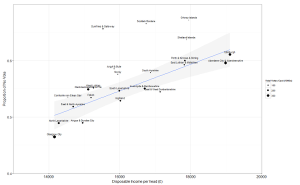
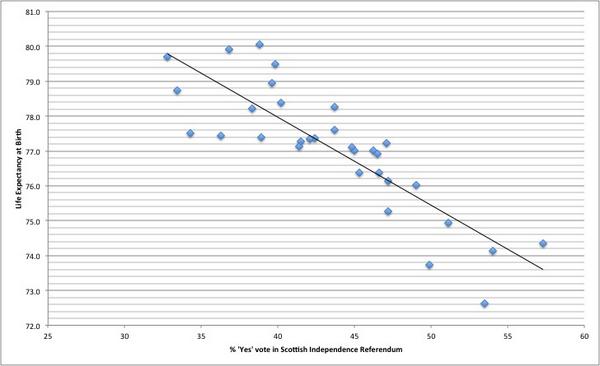
These graphs relate two metrics, life expectancy and income, with how people voted. In all four cases of the councils which voted Yes have the lowest levels of both. If anything, this proves to me that the Yes vote was effectively saying, “the system is broken – we need to change the system”.


The thinking behind the graphs is available on twitter, at the accounts shown.
Not much more needs to be said, I think.
UPDATE: Actually, this from Mike Russell which is published in the Sunday Times today.